
This tip will be about choosing the right colors for your card. Come back later for more tips on how to organize, cut, and assemble your card.
I know how the story goes. You go to look in your bin of scrap booking paper, and you decide that you don't want to pull everything out, because it will be nearly impossible to get it all back in, right? Well, it's probably like that if you are a person like me. :) I'm here to tell you that it's okay, you CAN dig through your drawers, because the end result will be worth it.
A good basis for color combinations would be to consult a color wheel. All you artists out there are probably familiar with one of these. But if not, never fear, here's your introduction. A color wheel consists of three different types of colors; primary, secondary, and complementary. Although you can go deeper into a color wheel, we're just going to look at these three.
Primary colors are the colors that all of the other colors are made of. These colors are: blue, red and yellow. You mix red with yellow you get orange, you mix blue with yellow you get green, and so on. The colors that these three make are: green, purple and orange. These are called secondary colors. Complementary colors are simply colors that are opposite each other on the color wheel. They compliment each other, hence the name. Complement colors are: orange/blue, purple/yellow, red/green, and all of the colors in between.
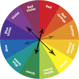
Sorry if you can't tell by looking at this.... but the complementary colors are colors OPPOSITE of each other on the color wheel, just as I stated. You can use this as your base, but it's not entirely necessary to create good color combos. Just a suggestion. Another suggestion of colors would be to pick a neutral color, such as black, tan or grey, and pair it with a more vibrant color such as yellow, red or purple.
For a card, I would choose about three colors, although you can use more or less, depending on how much you want, or what looks good. I would suggest choosing one neutral, and one-two complementary colors, or just one color to use as a pop with the neutral. Come back tomorrow for another tip on how to use patterns with cards!